Interactive Media Graphics includes thing such as Navigation
bars, menus and buttons. There is also animated graphics such as flash,
animated gifs, web headers and banners. As well as this there is logo graphics
which consists of things like symbols and screen icons. Finally there are
backgrounds and texture graphics like DVD menus and games.
Interactive
media needs the internet and uses a lot of what’s listed
above and the internet is the biggest platform for interactive media.
Starting with reading it is used when you have a kindle or on iPhone's and iPad's.

 Picture
elements are are
Picture
elements are are made up of pixels and how many pixels there are decides what the resolution of the image is. The more pixels the better quality the image generally an example of this would when two bitmap pictures are showed next to one another but one has a higher resolution, then you enlarge them both at the same rate and the one with the lower resolution will become pixelated much quicker. Colour depth is another important element that makes up pictures. It is also known as bit depth and it is how many bits are used to show the colour of a single pixel. So things such as an 8 bit image and 4 bit are totally different as there are more or less bits in the pixels. So the more
bits the
more colours that the pixel can be. 4 bit would allow 16 different colours whereas
8 bit gives you 256 colours. So better quality images will have more bits so
that they have the option to have more colours to more accurately portray an
image. The image above is clearly a 4 bit image because it uses limited colours
to show an image that needs more colour its depth of colour is very weak so the
image quality is poor. This other image is clearly an 8 bit image because it
uses many colours and shades of the same colour to show the picture with more
depth therefore giving the image a more real look which is better quality.
 I found an
article (https://fstoppers.com/education/cheap-camera-versus-expensive-camera-part-2-prints-73187) this
compares a cheap camera the Nikon D40x versus an expensive Nikon D800. In
this article and the article it links to it says about the differences and
whether it would be worth buying an expensive camera. It says that the more expensive camera is
definitely the better camera it’s more customizable has 36 megapixels in
comparison to the cheap ones 10.2 megapixels. The author said it had far better
image quality and was much more versatile in low light. However when she
compared the images and showed them to people nobody could tell the difference
between the two. The lesser camera didn’t cost any more than $150 and the
expensive was around $2000.
I found an
article (https://fstoppers.com/education/cheap-camera-versus-expensive-camera-part-2-prints-73187) this
compares a cheap camera the Nikon D40x versus an expensive Nikon D800. In
this article and the article it links to it says about the differences and
whether it would be worth buying an expensive camera. It says that the more expensive camera is
definitely the better camera it’s more customizable has 36 megapixels in
comparison to the cheap ones 10.2 megapixels. The author said it had far better
image quality and was much more versatile in low light. However when she
compared the images and showed them to people nobody could tell the difference
between the two. The lesser camera didn’t cost any more than $150 and the
expensive was around $2000.

Next section credit to Marcus Atkinson
Scanner Budget = Canon CanoScan LiDE 120 Flatbed Scanner. Resolution = 2400 x 4800 dpi. Capabilities = 16 seconds to scan a piece of paper. It can also scan colour pages. A4. USB Ports. Luxury = EPSON Perfection V600 Photo. Resolution= 9600 x 6400 dpi. Capabilities= Max A4. USB ports. 21 seconds scan speed. There is a big difference between the budget and luxury scanners. One of the differences are that the luxury scanner has a better resolution. Resolution is important because then you have a much better high quality and when you show the picture it will look better than the budget one. The speed is important and surprisingly the budget one is quicker than the luxury and this is key because you don’t want to waste time just waiting for it to finish.
Bitmap vs Vector Graphics
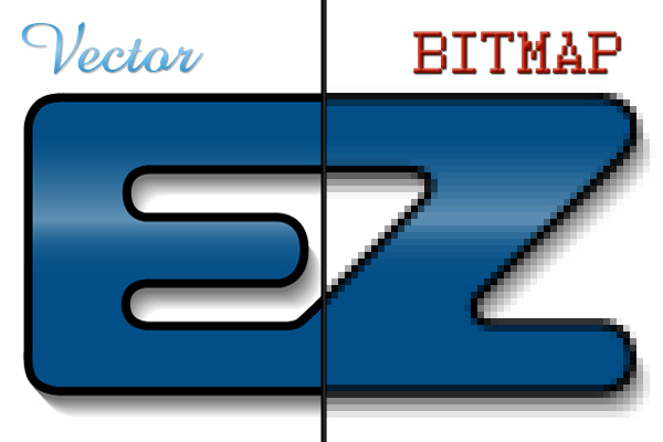
 Bitmaps have different applications to Vectors and
 Vectors are usually considered to be better image quality however you do not always need the best image quality because often you cannot tell the difference. Bitmaps use pixels, this is how they create the image. If you saved a Bitmap image the file name would be, jpg, png, GIF, tiff and bmp. If you try to make a Bitmap image larger (scale up) then it can for a time but will eventually become pixelated, however you can scale it down. Vectors can be scaled up or down and will never become pixelated because it uses mathematics to increase the image size. However Vectors take up a lot of data and for this reason for a standard image they are not used, they are usually used for things such as large billboards. Vectors use files name like eps, pds, ai and others. To make a vector image you will have to pay to buy Photoshop or adobe illustrator. An example of a Bitmap vs a Vector image would be the image of David Beckham we analysed to see if we could tell the difference. we couldn't tell the difference whatsoever until we scaled them both up for quite some time then you could notice that the bitmap image was becoming pixelated.
Colour
High colour is how we store image info in a computers memory. So each pixel is represented by two bytes. most colours are represented by 16 bits but some do support the use of 15 bit colour. True colour is the natural colour of an image and is the opposite of false colour. true colour is what we see with through our eyes and is impossible to render on a computer screen. A lot of images try to replicate an approximate effort at true colour. We try to depict images as close to the true colour as we can.

Monitor screen resolution. Greyscale is effectively black and white there are many different shades of grey. from white at the strongest to black at the opposite end. An example of when a Greyscale image is used is for measuring light intensity in the electromagnetic spectrum. You can synthesize a colour image into a black and white image. RGB stands for red, green and blue. RGB is used in making all the colours on your computer screen. On computer screens they add all the three colours in various different ways to make colour. every secondary colour is formed from two primary colours. an example of when RGB is used is just generally on the computer screen on maybe on television to show an image.
YUV Colourspace. The Y is how bright the colour is. The U and the V determine the colour itself. HSV stands for hue, saturation and value. Hue means saturation this is how bright it is.

Optimization is finding an alternate way to that is more cost effective and efficient and that will help you to achieve better performance. the way to do this is to maximize the things you need/want and the other unimportant things. this is done to reduce the file size. Compression is reducing the amount of bits that are needed to show data. Compression is either lossless or lossy. Lossless compression lets you reconstruct perfectly the data from the compressed data. an example of when compression is used is to compress a text file. Compression is done by using algorithms and the better the algorithm the better quality the compression will be. for example if it was an image the image would be in better quality. there is a limit to how much something can be compressed. a good way of imagining compression is looking at 2x2x2x2x2 as 2 to the power of 5.
Header:
Headers are described as supplemental data placed at the beginning of a supplemental block of data. headers are important to specify what you are reading is about. an example of when a header is used is on practically every single website so that you know what your reading is about to specify the details quickly and simply for the reader.
Banner
Web banners are a way of advertising your web page. this type of advertising is delivered by an ad server. Web banners are used to increase traffic for your website. When somebody uses the banner the advertiser pays the ad service around 5-10p for somebody clicking the banner. an example of a web banner is on one website such as GAME you might find a web banner for the XBOX website and then the advertiser would pay the content provider a small amount of money.
Logo
Logos are commonly used by company to promote recognition. logos are sometimes just a graphic like the Olympics logo. however some have graphics and the name of the organisation or a slogan, such as Nike.
Menu
You need menus for websites to be able to navigate the website easier. it gives you a list of options to help you find your way around. most websites will have a menu bar located toward the top of the page. An example of a menu would be on almost all websites at the top there will be menu with links to pages such as home, tools, gallery ect. This picture shows what I mentioned.

Nav Bar
Nav Bars use HTML as the base. All nav bars are built from a HTML list. These are intended to aid visitors in accessing information. they are implemented in file browsers, web browsers and are used as a design element of some web sites. web browsers include the backwards and forwards buttons. nav bars usually consist of tool bar and the address bar. an example of a nav bar is shown here it is similar to a menu.

Bibliography:
Logo
Logos are commonly used by company to promote recognition. logos are sometimes just a graphic like the Olympics logo. however some have graphics and the name of the organisation or a slogan, such as Nike.
Menu
You need menus for websites to be able to navigate the website easier. it gives you a list of options to help you find your way around. most websites will have a menu bar located toward the top of the page. An example of a menu would be on almost all websites at the top there will be menu with links to pages such as home, tools, gallery ect. This picture shows what I mentioned.
Nav Bar
Nav Bars use HTML as the base. All nav bars are built from a HTML list. These are intended to aid visitors in accessing information. they are implemented in file browsers, web browsers and are used as a design element of some web sites. web browsers include the backwards and forwards buttons. nav bars usually consist of tool bar and the address bar. an example of a nav bar is shown here it is similar to a menu.

Bibliography:
Vector graphic image (
Compression image (
Bitmap v Vector (
Nikon Image(
8 bit image (
Article credited earlier(https://fstoppers.com/education/cheap-camera-versus-expensive-camera-part-2-prints-73187)
Web menu
Compression image (
Bitmap v Vector (
Nikon Image(
8 bit image (
Article credited earlier(https://fstoppers.com/education/cheap-camera-versus-expensive-camera-part-2-prints-73187)
Web menu